Intigriti connects ethical hackers with organizations that need vulnerabilities found before attackers do. The platform had to serve two sides at once: researchers submitting findings, and companies managing risk, communication, and rewards.
I joined in 2016 as the first UI/UX Designer, through Monkeyshot. There was no design function, no design system, and no established UX practice. Just an early proof of concept that needed to become a trusted marketplace.
Two Audiences. One Platform. No Room for Ambiguity.
The core design challenge was making both sides feel clear without creating two separate products.
- Researchers — Needed a faster way to discover relevant programs, understand scope and eligibility requirements, submit vulnerabilities, and track communication and bounty payouts.
- Organizations — Needed efficient tools to manage incoming reports, assess and prioritize vulnerabilities, collaborate across teams, and maintain productive relationships with security researchers.
Researchers and organizations had different goals and mental models, but both needed clarity, trust, and speed.
Before There Was a Product, Someone Had to Build One.
First, we had to prove the marketplace could work.
Working closely with the founders and engineering team, I designed the core platform experience from the ground up across both sides of the marketplace. At this stage, speed and usability mattered most: enough product to support sales, serve early customers, and learn from real use.
Real Usage Revealed What the MVP Couldn't.
As adoption grew, the MVP started showing strain: more programs, more reports, more communication, and more enterprise stakeholders.
The Redesign Was Guided by Data and Customer Feedback.
To find the highest-impact redesign opportunities, I combined:
- Product usage signals around high-traffic and high-friction workflows
- Customer workshops with enterprise clients
- Feedback from customer-facing teams
- Stakeholder interviews with founders, sales, and engineering
- Opportunity mapping based on user impact and implementation effort
Together, these signals showed where design could create leverage without redesigning the platform on opinion alone.
Three Problems Kept Coming Back.
Across usage signals, workshops, and customer feedback, three problems kept coming back:
- Reporting workflows lacked clarity: reports contained too much information, status history, and next-step ambiguity.
- Communication was buried: comments and collaboration were central to the workflow, but visually deprioritized.
- Navigation did not reflect user behaviour: security teams had to move across disconnected sections to manage one operational workflow.
Those themes became the filter for the redesign.
I mapped them onto the workflows where they created the most friction: program discovery, navigation, dashboards, report detail, status management, and program lifecycle states.
I Turned the Patterns Into Workflow Redesigns.
Researchers Shouldn't Have to Hunt for Programs.
Customer feedback showed that researchers needed to scan programs faster, compare requirements more easily, and understand whether a program was relevant before opening the detail page.
I redesigned program browsing around clearer hierarchy, stronger visual scanning, and overview cards that made scope, eligibility, and next actions easier to understand.
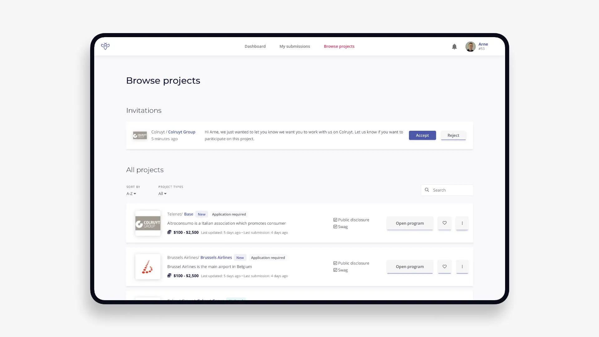
The new experience allowed researchers to quickly evaluate programs, understand requirements, and take action without unnecessary friction.
The Platform Was Structured for Engineers, Not Users.
Usage patterns and customer conversations showed that enterprise users were switching between programs and reports throughout the day.
I redesigned navigation around a persistent sidebar, improved search, and suggestions that made it easier to move between programs, reports, and ongoing activity.
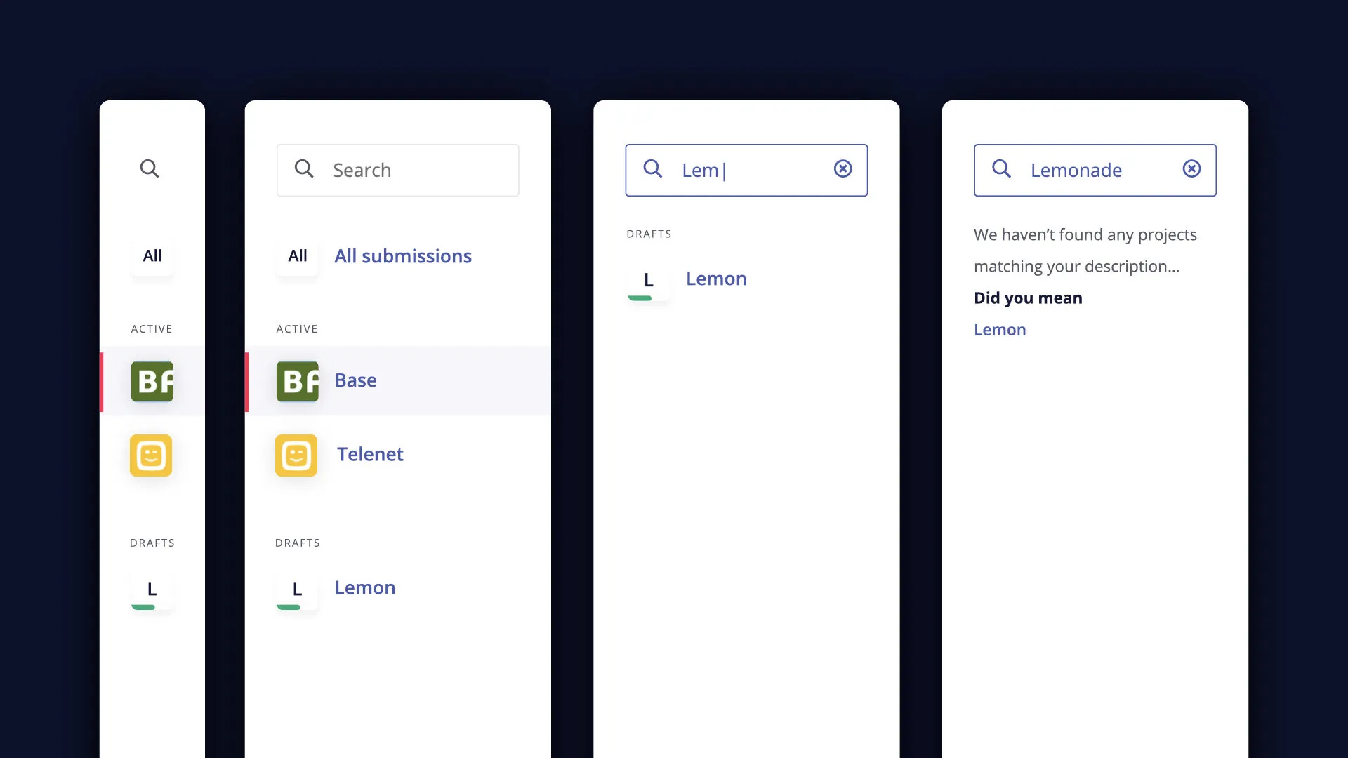
This reduced navigation complexity and made it easier for users to move between programs, reports, and ongoing activities.
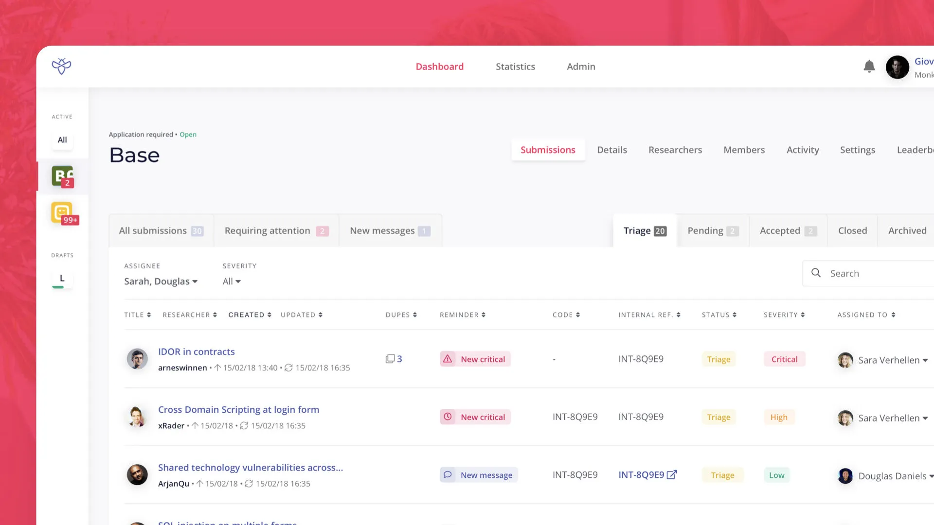
Security Teams Were Managing Risk Across Five Screens. I Made It One.
Workshops with security teams showed that report management was less about reading one report at a time and more about maintaining situational awareness across many active submissions.
I consolidated key information into a unified dashboard that surfaced active submissions, severity levels, status updates, and ownership information.
The redesign helped teams focus on prioritization and decision-making instead of navigation.
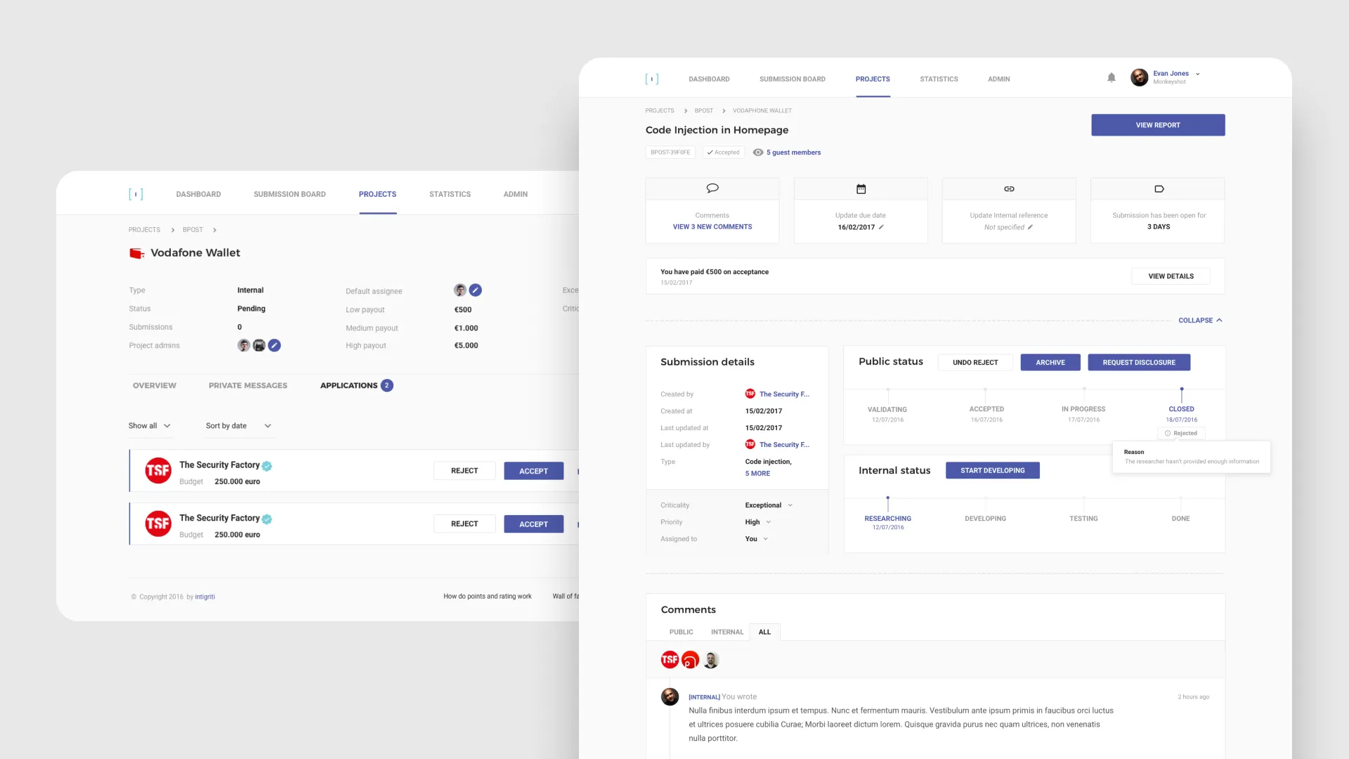
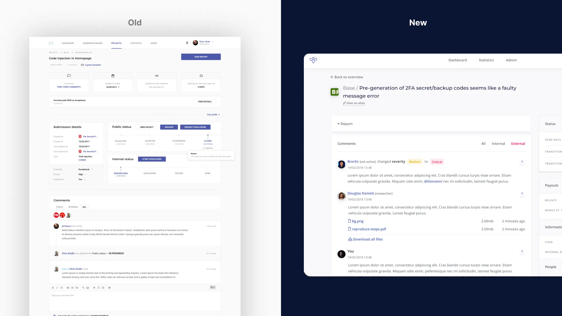
The Most Used Screen in the Product Was the Hardest to Read.
The report detail page was the most complex and business-critical screen in the platform.
Security teams used it to review vulnerabilities, communicate with researchers, assess severity, track history, manage payouts, and update statuses.
Feedback showed that users were losing context between status, communication, severity, and next actions.
I reorganized the page around the triage workflow itself, bringing communication, status information, and next actions closer together.
The result was a clearer experience that supported faster and more confident decision-making.
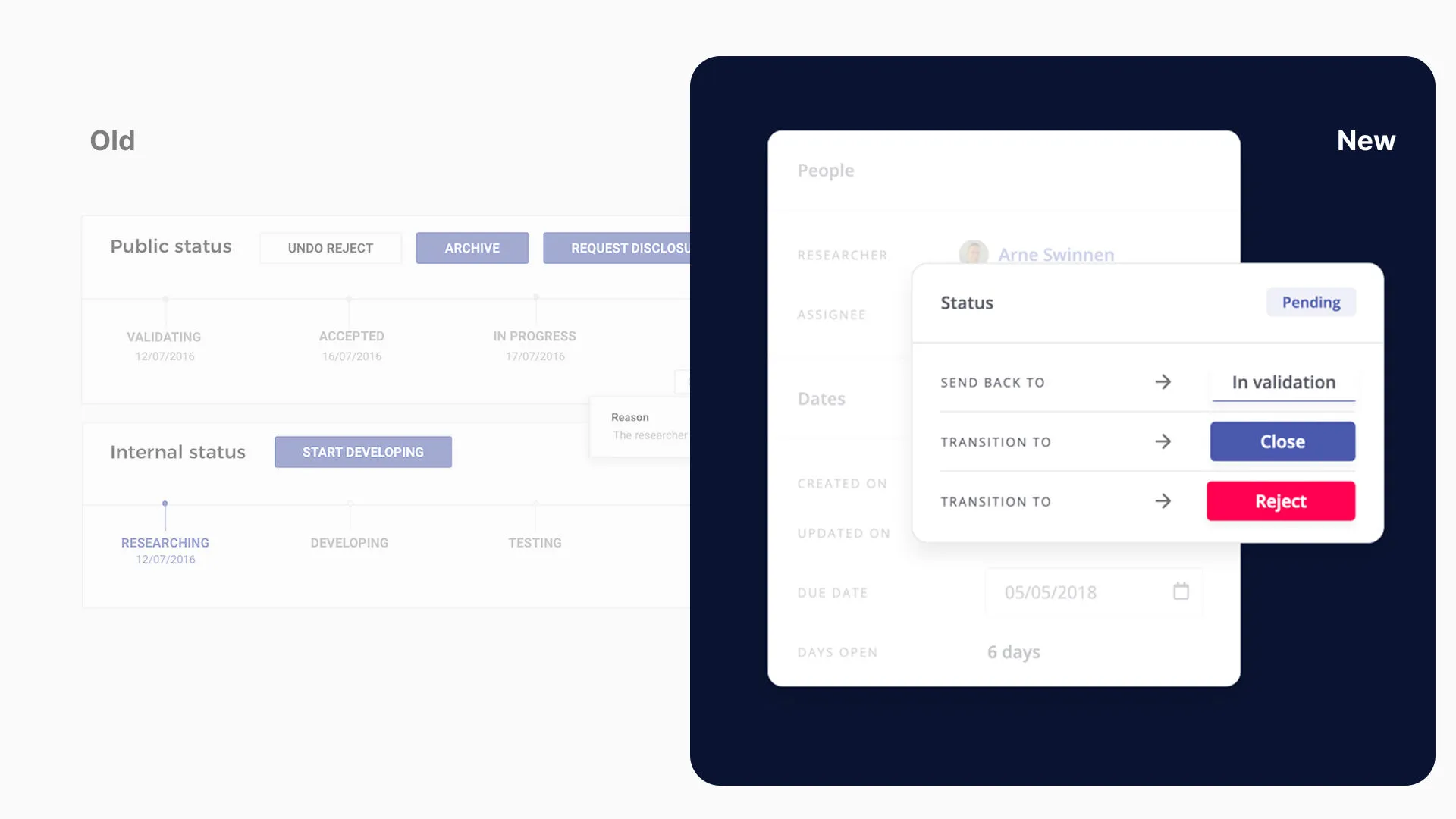
Status Management Was Trying to Solve Two Problems at Once. One Didn't Exist.
Customer workshops surfaced a recurring problem in how companies managed vulnerability reports after triage.
The platform supported both public and internal statuses, but most customers already used tools like Jira for internal remediation. Maintaining a second status system created unnecessary complexity.
I simplified the experience around the status that mattered most and made the available next actions explicit. This reduced workflow complexity and aligned the product more closely with how customers actually worked.
10,000 Researchers. 100 Clients. One Design Foundation.
By September 2020, Intigriti had grown into one of Europe's leading bug bounty platforms.
- 10,000+ active security researchers
- 100+ enterprise customers including Telenet, Brussels Airlines, and Tomorrowland
- One of the leading bug bounty platforms in Europe by 2020
The design language, information architecture, and core workflows established during those four years became the foundation that supported Intigriti through its most important growth phase.
The platform evolved from an early proof of concept into a scalable product capable of serving both sides of a complex security marketplace while maintaining trust, clarity, and operational efficiency.